Overview
When Leanne wanted to take her hairdressing career to the next level, she approached me to build a highly quality website for her mobile salon business. Leanne was clear on her objectives for the website and in the process, she outlined the importance of ensuring that it had young/ fresh appearance to match her brand.
This meant that the website had to make use of bright colours to represent her salon brand as an approachable small business. The website has performed remarkably well and is still receiving numerous bookings per month. The website is now a staple in Leanne’s strategy to grow the business over the next couple of years.
Deliverables
- Multi-Page Website
- Copywriting & On-page Search Optimisation
- Attained All Client Goals
- Domain Registration & Hosting
- Mobile Responsive
- Google Analytics Set Up & Integration
- Spam Filter On Contact Form
- Ongoing Support

Project Info
Challenge
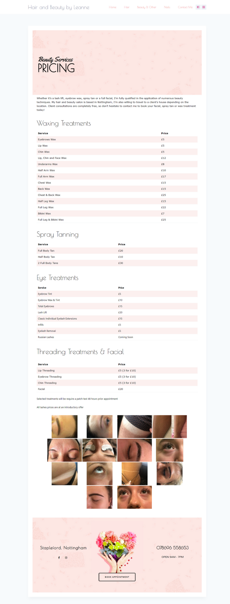
Leanne sought after a web designer who could bring all of her ideas together into one user-friendly design. This meant making use of youthful colours and high quality bold images to appeal to the her target demographic. In addition to this, it was also important to find a way to present Leanne’s extensive price list in a way that is easily digestable to the user.
Solution
In order to achieve this design, I prioritised ‘space’ between the different sections. This allows the user to only be presented with one section at a time to read when scrolling down the page, therefore, making it less confusing. Additionally, this also benefits visitors using mobile phones due to their reduced screen size, which has lead to low bounce rates and more conversions.
Website design
Hair & Beauty By Leanne
Website Design
The sections on the website are broken up through the use of alternating background colours. This works fantastically in delivering the page’s content in ‘bite-sized’ pieces as it signals to the reader when one section as ended and the other begins. In regards to the price list, it is clear for the user to find out what the various prices are due to the use of table. In addition, every page has a ‘call to action’ at the bottom which could be attributed to the high conversion rate. Overall, the user-friendly design makes the site incredibly easy to use for her visitors and is an inspiration for what small businesses can achieve with tight budgets.


